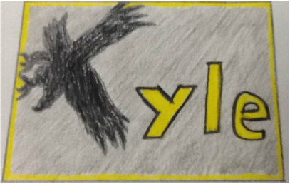
I wanted to do something simple for my logo. Last year for my photo name project I used the W-SR go hawk for my K. I turned it sideways to make it actually look like a K though. I decided to use that idea for my logo. I liked the idea and it wasn't that hard to draw but it would be kind of hard to carve. I just traced it on to my lino block and caved it out with the finest point. It turned out to look really good after I printed it and I liked it.
I think your printmaking is really cool. I did something similar but I drew the Go-Hawk and put my initials in the wings. I like how you made the letter ''K'' a hawk.
Reply
Elizabeth
2/2/2015 01:57:00 am
One thing that really stands out is your design. i love how you designed the K to be hawk. the colors really stand out and it looks great.
Reply
Joey Brinkmann
2/3/2015 12:11:26 am
I like how you made the gohawk into a K.
Reply
chris
2/12/2015 12:39:07 am
I like the creativity in making the Go-Hawk into a K.
Reply
Dawson
2/12/2015 12:49:39 am
Your logo is very creative and cool. I really like your idea in your logo.
-great job
Reply
alex
2/12/2015 01:28:11 am
Very cool idea using the hawk for the K. Never really looked at it like that.
Reply
Joey Brinkmann
2/23/2015 12:38:47 am
I like the way you converted the gohawk into the first letter of your name.